How to Build a Marketing Dashboard: A Practical 2026 Guide
A marketing dashboard turns scattered campaign data into one screen your team actually checks. According to Gartner, marketing budgets sit around 7.7% of company revenue in 2024, so leaders want clear proof of where that money goes. Building the right dashboard is how you give them that proof, fast and without guesswork.
This guide focuses on the build itself: scoping, wiring data sources, choosing layout, and shipping something people use daily.
Key Takeaways
- Start with one decision per dashboard, then pick only the metrics that inform it.
- Limit each view to 5-7 metrics so it stays readable at a glance.
- Marketing budgets average 7.7% of revenue (Gartner, 2024), so dashboards must prove return clearly.
- Automate data refresh and delivery early, before manual updates become a chore.
- A dashboard nobody opens is wasted work, so design for the actual viewer.
What Should a Marketing Dashboard Actually Do?
A good marketing dashboard answers a specific business question on sight, not just displays numbers. Globally, Statista reports the big data and analytics market continues double-digit growth into the mid-2020s, which means more raw data than any team can read manually. The dashboard's job is filtering that flood down to decisions.
Think of it as a tool, not a trophy. Before building, name the one question it answers. "Are we hitting our cost-per-lead target?" is a question. "Show me everything about marketing" is not. The narrower the scope, the more useful the result.
The Three Jobs a Dashboard Does Well
A dashboard consolidates data, surfaces change, and triggers action. It pulls feeds from ad platforms, web analytics, and your CRM into one place. It highlights what moved since last week. Then it points the viewer toward a next step, whether that is pausing a campaign or shifting budget.
For deeper context on the metrics themselves, our data-driven marketing guide covers how to choose what matters before you visualize it.
How Do You Scope a Dashboard Before Building?
Scoping decides whether your dashboard gets used or ignored. Research summarized by McKinsey consistently shows that organizations acting on customer data outperform peers on growth and profit. But action only happens when the right person sees the right number, so scope around the viewer first.
Ask three questions before you open any tool. Who opens this view? What decision do they own? What action should the data unlock? A CFO scanning marketing ROI needs different numbers than a paid-search manager adjusting bids at 9 a.m.
Match the Dashboard Type to the Viewer
There are a few common patterns worth knowing.
- Executive view: revenue, blended ROI, budget pacing, year-over-year growth.
- Campaign view: impressions, clicks, CTR, conversions, cost per acquisition.
- Channel view: one screen each for paid search, social, or email specifics.
Pick one pattern per dashboard. Mixing an executive summary with channel-level granularity creates a screen that serves nobody. If two audiences need the same data at different depths, build two linked views instead of one crowded one.
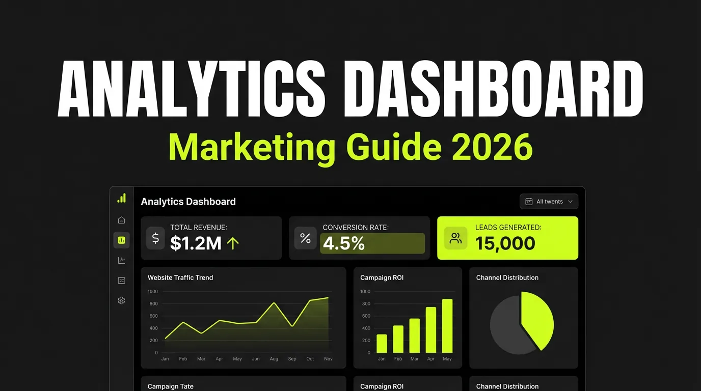
Which Metrics Belong on the Dashboard?
Limit each dashboard to 5-7 metrics, because attention drops sharply past that. A widely cited finding from cognitive research, popularized through Nielsen Norman Group usability work, is that working memory holds only a handful of items at once. A cluttered dashboard forces re-reading, which kills the speed advantage you built it for.
Choose metrics that pass three tests. They must be actionable, meaning the viewer can change them. They must be comparable across time. And they must be understood the same way by everyone reading them.
Core Metrics Worth Tracking
| Metric | What it tells you | Why it earns a slot |
|---|---|---|
| Conversion rate | Share of visitors completing the goal | Direct signal of funnel health |
| Cost per acquisition | Spend per new customer or lead | Keeps efficiency honest |
| Return on ad spend | Revenue earned per ad dollar | Ties spend to outcome |
| Customer lifetime value | Long-term worth of a customer | Prevents over-paying short term |
Resist adding "nice to know" numbers. Every extra tile competes for attention with the metric that drives the decision. When in doubt, leave it out and link to a detailed report instead. For how these numbers connect to channel performance, see our performance marketing guide.
How Do You Connect and Clean the Data Sources?
Data wiring is where most dashboards quietly break. Industry surveys collected by Statista show poor data quality remains a top barrier to analytics success across organizations. A dashboard that pulls from mismatched or stale sources will mislead the very people it should guide, so connection comes before design.
Map every source you need first. Common feeds include web analytics, Google Ads and Meta Ads, your CRM, and email platforms. Decide how each one defines a "conversion," because mismatched definitions are the most common cause of numbers that refuse to reconcile.
Set a Refresh Cadence That Fits the Decision
Match update frequency to how the dashboard gets used. Active campaign views need near real-time or daily refresh. Strategic executive views can refresh weekly without losing value. Automate these refreshes from the start, since manual updates get skipped under pressure and stale data erodes trust quickly.
Attribution choices also shape what your numbers mean. If you blend channels, decide on a consistent model so credit is not double-counted. Our attribution modeling guide explains the trade-offs between first-touch, last-touch, and multi-touch approaches.
What Makes a Dashboard Layout People Actually Use?
Layout determines whether a dashboard reads in seconds or requires study. Usability principles documented by Nielsen Norman Group show that people scan screens in predictable patterns, weighting the top-left heavily. Designing against those patterns means viewers find the headline number without hunting.
Put the single most important metric top-left, where eyes land first. Group related tiles together so the viewer's gaze flows logically. Keep colors consistent: pick one color for "good," one for "needs attention," and never reuse them for decoration.
Add Context So Numbers Mean Something
A raw number rarely guides action on its own. Always pair each metric with a comparison, such as last period, target, or benchmark. A conversion rate of 3% means nothing until the viewer sees it is up from 2.4% last month and below the 3.5% goal. Trend arrows and small sparklines carry this context without adding clutter.
For analytical depth beyond layout, including segmentation and cohort views, our marketing analytics dashboard guide goes further than this build-focused walkthrough.
How Do You Avoid the Common Build Mistakes?
Most dashboard failures trace back to a handful of repeatable mistakes. Reporting from Forrester on data and analytics maturity highlights that insight without a clear path to action rarely changes behavior. In practice, that means a beautiful chart nobody acts on is a failed dashboard.
Four mistakes show up again and again, and each has a simple fix.
The Four Fixes
- Too many metrics: trim to 5-7 and link the rest to detail reports.
- No clear action: add thresholds and alerts so the screen tells viewers when to react.
- Stale data: automate refresh instead of trusting manual updates.
- Mismatched definitions: document how each metric is calculated and share it.
Set automated alerts for the moments that matter. A drop in conversion rate below your floor, ad spend running ahead of budget, or a sudden traffic crash should ping the owner without anyone needing to stare at the screen.
Frequently Asked Questions
How many metrics should a marketing dashboard show?
Keep each dashboard to 5-7 metrics. Working memory limits, documented through Nielsen Norman Group usability research, mean people struggle to track more than a handful of items at once. If you need more numbers, build a second linked view rather than crowding one screen.
What tools can I use to build a marketing dashboard?
You can build dashboards in Google Looker Studio for free, in Tableau for advanced visualization, or in dedicated platforms that pre-connect ad data. The right choice depends on your data sources and team skills. With analytics demand growing steadily (Statista, 2020s), most tools now offer ready-made connectors.
How often should dashboard data refresh?
Match refresh frequency to the decision. Active paid campaigns need daily or near real-time updates, while executive strategy views can refresh weekly. The key, supported by Statista findings on data quality barriers, is automating the refresh so stale numbers never quietly mislead your team.
What is the difference between a dashboard and a report?
A dashboard shows live, scannable metrics meant for quick monitoring and action. A report is a deeper, point-in-time analysis you read once. Both have value. Organizations that act on data outperform peers, per McKinsey, so use dashboards for daily steering and reports for periodic deep dives.
Conclusion
A marketing dashboard earns its place when it answers one clear question and drives a decision. Start small: scope around a single viewer, pick 5-7 metrics, wire clean data sources, and automate the refresh. Then design the layout so the headline number reads in seconds, with context that points toward action.
The best dashboard is the one your team opens every morning, not the one with the most charts. Build for use, not for show, and expand only when a real decision needs more.
Ready to skip the manual wiring? Explore the AdBid AI Ads Manager to connect your ad data and surface decisions automatically.